Designing effective graphics for mobile devices is a challenge. Graphics on mobile are different from desktop devices. Designers need to understand the complexities of working with mobile technology. Here are six ways to make your graphics work on mobile devices.
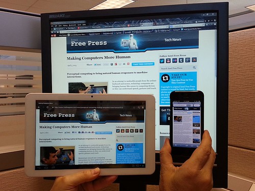
1. Design for Multiple Resolutions

Image via Flickr by IntelFreePress
When you design graphics for a mobile device, you have to consider that the screens are smaller than the large desktop monitors you’re used to designing for. Those large monitors usually display graphics at 1920 x 1200 and higher. Mobile devices are a whole new world. You’ll need to remember that each mobile device has a different resolution and size. You can no longer design for one size and resolution. Instead, create multiple graphics to show how they will look on different mobile devices.
2. Use a Fluid Layout

Image via Flickr by Florin Hatmanu
Most smartphones come with G-sensor. This sensor understands how the phone is oriented and then displays the information correctly. That means images will show up in portrait or landscape setting depending on how the user is holding the device. It’s important to understand this as you design. You should apply a fluid layout for your designs on mobile devices. If you’re using background images in your application, you’ll want to stretch or tile them. You’ll need to create a portrait and landscape layout for your app so that the graphics fit each screen orientation.
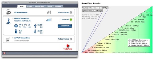
3. Keep Your Files Small

Image via Flickr by Wayan Vota
When you design for mobile websites, you’ll need to pay closer attention to the user’s connection. Try to optimize images for a faster load time because not everyone has 4G speed. This necessity comes from the way mobile devices work. Though service providers continue to constantly bring out faster speeds, in some areas, coverage stays spotty at best. At the same time, there are users out there who don’t have unlimited data plans. Put simply, these folks have to pay for their data downloads. As a result, you’ll want to cut down on code and take away unneeded comments and tags. Keep your files and images small and compressed to bring down time for downloads.
If you create an app, you need to remember the file size restrictions. If an app is over 50 MB, the user will need a Wi-Fi connection to download it. If you create an app designed for on-the-go, it’d make sense to keep it under 50 MB.
4. Use PNG Image Format

Image via designtutorials4u.com
The image format you choose goes a long way when it comes to creating usable graphics for mobile devices. Instead of .gif, use .png as your preferred format. This format gives you greater color depth. With variable transparency it’s also fully lossless. The .gif format has either fully transparent or opaque pixels. The .png format, however, comes with up to 254 levels of partly transparent pixels, which allows you to take full advantage of alpha transparency.
5. Optimize Your Colors

Image via Flickr by kga245
Smartphones vary in their color support, so you need to design your graphics for this. Phones like Blackberry and HTV support 65,000 colors. On the other hand, smartphones from Nokia and the iPhone support 16 million colors. That makes a big difference, as with 16 million colors, you’ll show better graphics that have sharper and brighter images. If you’re working from a Windows PC to create graphics for iPhones, you’ll want to go to the View menu to set “Proof Setup” to “Macintosh RBG.” Doing this helps correct your colors. You’ll get a soft proof of the colors to stand in for the standard color palette for Mac OS, and that will help you to pick your colors and contrast.
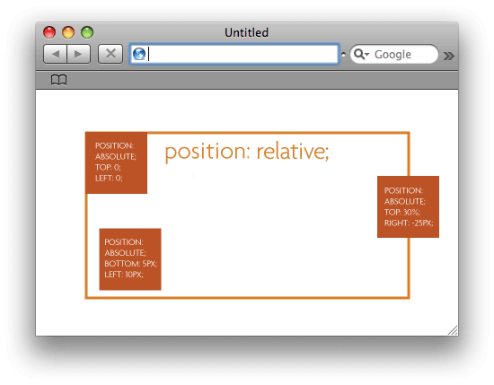
6. Use Relative Pixel Sizes

Image via css-tricks.com
When you’re creating designs for smaller screens, you need to stay away from defining dimensions in absolute pixels. For example, if you set a width of 200 pixels, it may turn out to take up most of the screen on certain phones. Instead of setting absolute sizes, use relative sizes. Use things like percentages and ems. This will help make sure that the size automatically adjusts to fit the screen it’s displayed on.
There are many ins and outs to designing graphics on mobile devices. Learning the little details of how mobile technology works is crucial for making mobile apps and websites that wow your users.


This comment has been removed by a blog administrator.
ReplyDelete